Sunday, December 29, 2013

Master Bath Redo Part II

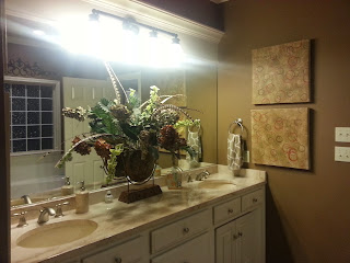
If you recall, back in November I painted and re-decorated my master bath.  There was nothing wrong with how my master bath looked, but I was ready for a change.  This is what my master bath looked like prior to November 11, 2013: 


 And change is what I did:


Initially, I liked the color, but the longer I lived with it, I felt like the room was SCREAMING!! at me every time I entered.  I still like the color (SW Maxi Teal), but I didn't like it for my master bath--maybe in a powder bath.  The room did not reflect me.  

I can't live with a room that doesn't make me happy, so it was time to change the color.  I decided on SW Rain.  Here's the reveal:


This color is very tranquil and calming.  It's a smokey, dirty blue.  To be honest, I am a little surprised that I picked SW Rain since I am partial to dark hues, but I am glad I did.   My bathroom is no longer screaming at me.  The color gives my bathroom a spa feel.

I always say that changing the color of a room is the least expensive way to re-decorate but it can make the most dramatic change.  A gallon of paint cost around $30.  I always pick Sherwin Williams colors, but I take the paint swatch to Home Depot and have the paint mixed using Behr Premium Plus Paint and Primer.  In my opinion, Behr paints cover very well.  The teal was covered over with one coat, but I always paint a second coat to make the color more saturated.

Let me know how you like the new look!

Saturday, December 14, 2013

On the Hunt For a New Color

I spent some time at Sherwin Williams today looking at paint colors for my master bath.  I think I have talked myself out of painting my bathroom red.  My study is red (SW Red Barn) and I want that room to be different than the other rooms in my house.

I keep going back to my friend's master bath in Louisiana.  I love her bathroom.  Yes, it is a pastel color, but I love the look of it.  I always tell people they should go with their emotions when picking out art work and paint colors.  If you have a strong reaction to what you see, go with that reaction.  You'll know it when you see it.

On my latest trip to Sherwin Williams, I narrowed down my search to three shades of light blue--SW Aqua Sphere, SW Rain, and SW Interesting Aqua:


I chose these colors because they had a smokiness to them.  Since my trim color has tan in it, I didn't want a blue that had a touch of red or purple in it.  I needed a blue that had a touch of brown in it so that it would look good next to my trim color.  There are a lot of things to consider when picking out a paint color.  You want to have a connection with that color, but you also want to make sure that it blends well with your trim color.  My master bath also has crown molding, so it is important that my color choice works well with the trim color.

I am leaning towards SW Rain.  It is the color shown in the middle.  It is also on the same color chart with SW Interesting Aqua.  

Stay tuned.....

Thursday, December 12, 2013

I think I know what the problem is...

I've been thinking about my bathroom color and realized today why I'm not in love with it--the color is a cold color and I gravitate to warm colors.  I enjoy looking at rooms with pastel colors, but I don't want pastel colors in my house.  I equate pastel colors with little girls' rooms.  I have seen lots of photos of elegant rooms done in pastel colors, but pastels are not a hue that I am in love with.

So, now I am on the hunt for a new color for my bathroom.  The space started out painted Sherwin Williams Latte.  I picked this color for the entire house.  After living here a few years, I decided I needed a change.  I would say that the SW Maxi Teal color is definitely a change.

My best friend in Louisiana built a home about two years ago.  Her master bathroom is painted Robin's Egg Blue.  I am in love with her bathroom.  I didn't think the color would work in my space because my trim work is not painted as white as hers.  Also, my ceramic tile floors have more tan/brown in them than her floor.  So now I am wondering if I should paint my bathroom in a pastel shade?


Or, should I go bold again with a warm color palette?


Decisions, decisions....

Monday, December 9, 2013

A Woman's Perogative.....

I painted my master bath November 11, 2013.  I went outside the box and picked a color that was not typical for me.  The color I chose--Sherwin Williams Maxi Teal--is a deep, rich color, but I'm not sure if I want to live with it for very long.  I liked the color after I finished painting my bathroom, but now I am unsure about it.


The main problem with the teal color is trying to find accessories that will go with the color.  I was afraid that by painting my bathroom teal that it would look like a kid's space instead of an adult space.  I am dangerously close, if not already there, to my bathroom looking like a kid's space.

So, you know where I'm going with this.  I already have a new color in mind for my master bath.  It's still not in the taupe/tan/brown family.  It's another "outside the box" color, but I think it will be a color that better represents my house.

Stay tuned.....


Beautiful Christmas Trees--Just Not at My House!

Just because I didn't put up my Christmas tree this year doesn't mean I don't enjoy looking at other beautiful trees.  I was in Dallas December 2-3, 2013 and I stayed overnight at the Fairmont Hotel in the heart of downtown Dallas.  The Fairmont doesn't have any of the business traveler free amenities (complimentary breakfast, free WiFi, free USA Today), but the hotel offers killer views of the Dallas skyline at night.

I was fortunate to be in Dallas during the Christmas season.  Dallas is a city that is known for extravagant Christmas displays.  The hotel was fully dressed out in  Christmas decorations.  There were numerous trees displayed throughout the lobby and beyond.  The main tree in the lobby was decorated with various sizes of ornaments in the colors of fuchsia, bronze, and gold.  I never would have thought to put those three colors together, but the colors worked great together.  


Here are other samples of the Christmas trees throughout the hotel lobby.


There were several commercial buildings in downtown that also displayed beautiful Christmas decorations.  One of the bell hops brought this beautiful wreath to my attention.  The wreath was displayed high up on the outside of this building located on Akard Street.


Enjoy!

Sunday, December 8, 2013

All Wrapped Up!!

I put up my first Christmas tree in 1987 when I moved into my very first apartment.  Since that time, I have put up a Christmas tree every year--except for this year.  Womp-womp...

I decided earlier this year that I was not going to put up a Christmas tree.  I wanted my decorations be very minimal.  A lot of work is involved in putting up my tree.  My Christmas tree and accompanied decorations are stored in my attic.  When I was younger, it was no big deal to go up and down the attic ladder pulling the tree down and about a dozen plastic bins along with it.  For the past three or four Christmases, my great-nephew volunteered to bring my tree and boxes down from the attic.  That was great!  Now that he has moved to Dallas, that duty returns to me.  

So for Christmas 2013, I didn't put a Christmas tree up, but I did decorate my fireplace mantle.  What I did is very easy to duplicate.  All you need are small boxes in various sizes, ribbon, wrapping paper, snow (I used cotton balls), and ornaments.  I also removed my artwork and placed a mirror above the mantle.


Wishing everyone a Merry Christmas!

Saturday, November 30, 2013

Mr. Christmas!!

My nephew, Ka'Run, has been decorating Christmas trees for several years now.  When he was in grade school, he started decorating Christmas trees for his bedroom.  A few years ago I started letting him decorate my Christmas tree.  I love looking at Christmas trees, but I don't enjoy pulling the tree down from the attic and the dozens of boxes with all of my ornaments.

This is Ka'Run's first tree for his new home in Dallas.  He was so excited to show me what he did.  In fact, we did FaceTime because he wanted me to see his work live.  I am so proud of him and I wanted to share his work with others.  Enjoy!


Can you see the snowflakes?


Breakfast bar


Wednesday, November 20, 2013

Things I Love!!

Another installment of Things I Love!!!

I subscribe to five decorating magazines and several online publications.  When I see pictures of something I like, I save it to iPhoto to share later.  Here are two examples of spaces I wanted to share with you.  I picked both of these spaces based solely on the wall color.  I am partial to dark walls.  Dark colors add a certain richness to a space.  Don't get me wrong, I like lighter hued walls as well but I lean more to darker shades.

Courtesy of House Beautiful


These colors are so cozy to me.  Even though the colors are dark, there is still a lot of light in the spaces.  I really love how the ceiling is painted the same color as the wall in the bedroom photo.  I imagine at night time this space is like a cocoon.  Looking at this makes me want to paint my bedroom walls and ceilings dark.  Stay tuned!!

My Niece Has A New Place!

My niece Ashli moved into her new apartment over the weekend.  I was on hand to help make her place feel like a home.  I was so excited that my niece wanted artwork on her walls!  Nothing makes your space feel more like a home than artwork on the walls.  Ashli had purchased three pieces of artwork when she moved into her last apartment.  With this new space, she purchased five more pieces to hang.  I also gave her a piece of artwork that I purchased for my home but the piece did not work where I wanted to hang it.

If you are a renter, don't let that stop you from hanging artwork on the walls.  I rented for 9 years before I purchased my first home.  I had artwork on the walls in the three apartments I lived in.  Always keep a small container of spackle on hand to fill in the holes.  And, get to know the maintenance staff at your apartment complex.  I was always able to get a small jar of the wall color for touch-ups from the maintenance staff.

Another thing that was missing in Ashli's decor was accessory pillows for her sofa, love seat, and recliner.  She purchased new living room furniture for the other apartment, but the furniture did not come with accessory pillows.  You all know how I feel about pillows--the more the better!!  So, we headed to Garden Ridge to find pillows for Ashli's furniture.  Without the pillows, her furniture was sort of blah.  The pillows really pop on her furniture and liven up the space.

I like shopping with my niece.  She knows what she likes and doesn't like.  And, she makes her decisions real quick.  She's a lot like me I guess.  My only advice to her was to pick out something she would enjoy looking at.  Don't just pick out a piece of artwork to fill in a space.  Here are pictures of her living room, breakfast bar and kitchen.  I provided the artwork on her kitchen wall.

I purchased a pillow for the recliner, but the picture was taken before the pillow.


Ashli picked out the artwork over her breakfast bar.

Thursday, November 14, 2013

Master Bath Reveal!!!

In an earlier post, I talked about painting and re-decorating my master bathroom.  In the eight years I've lived in this house, this is the third time I've painted my bathroom.   The two prior paintings were both done in colors from the same color chart--various shades of taupe and brown.  In fact, I used three colors from the chart and did a stripe effect.  That was one of those ideas that worked fine on paper but didn't translate well in reality.  The last painting was done a few years ago and I decided to go dark.  The color choice was Sherwin Williams Steady Brown.  I have a thing for dark colors.  For me, artwork pops better on a dark hued wall.  Everything looks richer when the walls are dark.  

So, for the past 4 or 5 years, this is how my bathroom looked:


I liked the look, but I was ready for something more dramatic.  I'm not even sure how or why I came up with the new color.  The artwork actually came before the paint color.  I wanted something different--something outside of the taupe and brown color.   So, this is what I chose-- Sherwin Williams Maxi Teal:


When I painted the first swatch of color, I wasn't sure if I was going to like it.  My first thought was, "Oh my God, I've made a mistake!"  But, that is a typical response when ever you depart from something that is usual or familiar to you.  I think this is one of those looks where you will either love it or hate it.  My sister doesn't like it.  She says this room doesn't look like the rest of my house--and it doesn't.  My niece loves it.  I didn't love it at first, but the next morning when I turned on the light, my first thought was this is a happy space!  

I didn't want my bathroom to look juvenile with this color, but the right accessories can keep it out of the kiddie zone.  I saw the artwork at Garden Ridge and I liked it so I purchased it.  Then I took the artwork to Sherwin Williams to find a color to use on my walls.  There are several colors in the artwork--red, yellow, orange, but for some reason the teal jumped out at me.  I got rid of the silk arrangement that was on my vanity.  This arrangement has been on my vanity since I moved into the house and I was so over it.  My niece proudly displays it in her house now, along with the rag rugs.  I decided to display orchids on the vanity.  It's a cleaner look and I think it goes well with the new color.

Let me know your thoughts on the redesign-love it or hate it!


Tuesday, October 29, 2013

What's On Your Coffee Table?

Most people I know have a coffee table in their living rooms.  I don't know how far back coffee tables go, but the use of them or their function has certainly evolved.  TV shows from the 1950s always showed stylishly dressed people sitting in a formal living room around a coffee table drinking, what else, coffee.  

Hardly anyone has the time to sit around a coffee table and enjoy a cup of coffee or tea.  Coffee tables have evolved to become a place to display decorative accessories.   Coffee tables in a lot of homes serve many purposes:  dining table, a place to display collectibles, and sometimes catchall for things you have no where else to put.  You'll find coffee tables in some homes with some type of floral arrangement on them (hopefully not coated with dust!)  

My coffee table serves two purposes: (1) a place to display decorative accessories and (2) a place for decorating magazines and books for guests to browse through.  I try to keep the magazine collection current.  I don't want my coffee table to mimic tables you see in a doctor's office that have magazines from two years ago.  I try to maintain my magazine collection for about one to two months then I donate them.

I am always fascinated by coffee tables that have unusual decorative items placed on them.  Such items serve as a conversation piece.  I have a glass knot on my coffee table.  Most of my guests are curious about this art piece.  Take a look at my coffee table:

See the glass knot, top right corner.

As you can see, my coffee table is a 3 foot by 3 foot glass top table.  I chose a glass top table because my living room space is small and a glass top coffee table allows the room to appear more spacious--it disappears in the room.

Below is a picture of a coffee table with a tray, plant, books/magazines, and miscellaneous decorative pieces.  I'm sure the items placed on this coffee table are there to be used and also add a decorative touch.

Photo courtesy of House Beautiful Magazine.
So, what's on your coffee table?

Monday, September 30, 2013

Yes, I admit it--I have a pillow fetish!!

I can't help myself.  I love pillows.  I don't know what it is about them, but I just love them.  The really nice pillows are pricey.  I've seen some as much as $300.  I love pillows, but not for $300!!  Last weekend, I saw these pillows in Garden Ridge.  I went so far as to put them in my shopping cart.  But, I decided that I had enough pillows, so I put them back on the shelf.  (You should see the top shelf in my closet!)  This past Sunday, I decided that I wanted the pillows so I went back to Garden Ridge.  I didn't see the pillows right away.  I had to hunt for them amongst 12 rows of pillows.  I found two that had the same print, but the colors were different--too springy.  Then finally, I spotted one pillow that had the fall colors on them--oranges, browns, greens, golds.  So, the search was on to find another one.  About 10 minutes later, I managed to find one.

I placed the pillows on my bed.  I thought I would be happy using the pillows that were made for my living room furniture, but the colors were not vibrant enough for me.  I'm happy with my choice, I knew they would work.  So, here are my new fall pillows:


Thursday, September 26, 2013

Things I Love

Periodically, I will share with you some of the decor items I see that I absolutely love.  This week, I was staying at the Fairmont Hotel in Dallas, TX.  The hotel has recently upgraded its rooms.  There was a bolster pillow on the bed that was a khaki linen with silver leafing on it.  I loved this pillow.  I wanted to take it home with me.  Sadly I left without it.


The room had a wingback chair with nail heads.  I wasn't sure if I liked it at first, but the more I looked at the chair, it grew on me.  I really liked the form of the chair.  I wasn't as crazy about the fabric pattern.  I imagined this chair done in a deep blue or purple velvet with the nail heads.


I think I have a pillow fetish!  This pillow was in the wingback chair.  It was a blue velvet pillow with black velvet  insets.  I loved it!


The Front Porch Dilemma

A few nights ago, I was thinking about what I could add or change to my front porch fall decor.  Mums are a big part of fall, but I didn't want to add mums to the look because I've had mums on my front porch for the last 7 fall seasons.  After pouring through a few design websites, I decided to remove the boxwood balls and add pumpkins and leaf vines to the planters.  So, this is what it looks like now:


I still like this look better:


What do you think?

Tuesday, September 24, 2013

A Free Makeover!!

Depending on the seasons, I have two different comforters for my bedroom.  One comforter is for the spring and summer, and one is for the fall and winter. In the summer months, I use a coverlet and roll the comforter back to the foot of the bed.  Last weekend, I changed out the comforter to the fall/winter look. This year, I decided to flip the comforter and pillow shams over to the other side.  For accessory pillows, I looked in my closet at the various pillows I have stored there.  I used two pillows that originally came with my living room furniture and other pillows I purchased from Target and Garden Ridge.  I was able to get a new look and it didn't cost me a dime!  Believe me, that is a rare occurrence.


Now there is artwork in every room in my house!

Seriously, I finally found a piece of artwork for my laundry room.  About a year ago, I saw a canvass print in Garden Ridge that was intended for a laundry room.  I didn't buy it when I first saw it.  When I went back a week later, I couldn't find it.  Sometimes the bins in Garden Ridge get really disheveled making it impossible to find anything.  So, I gave up on finding a print for the laundry room.  But, a week ago I was in Garden Ridge and there it was--artwork for my laundry room.  It is the perfect size for the wall where it is displayed.  I love it!  Now I have artwork in every room of the house!


Okay, my new fall door is revealed...

Well, I have a different look for my fall front door.  I wanted a more sophisticated look than past years.  I decided to ditch the wreath and the mums.  I added fall leaves to the glass door (placemats from Bed, Bath, & Beyond).  I kept the pumpkins.  Instead of mums, I left the ball boxwoods in the planters.  I showed the revised look to family members (sister, niece, great nephew, and sister-in-law) and none of them liked the new look.  They all said I needed more stuff.  My nephew does not like the boxwoods.  He said it doesn't look like fall.  It's okay to leave some greenery in your display.  So, I decided to do something radically different.  I went to Hobby Lobby and purchased bamboo sticks, spray painted them yellow, and placed them behind each planter.  My family members didn't care for the bamboo sticks, but I like them.  I think the bamboo sticks add a bit of quirkiness to my fall front door look.  Check it out.


Thursday, September 19, 2013

What to do with my front door??

Okay, I have to decide what to do about my front door decoration.  I get stuck in a decorating rut and it's hard to climb out.  For the past eight fall seasons, I have put the same decor on my front porch:  fall wreath, mums in the planters, scare crows sticking out of the mums, and pumpkins on the porch.


It's an easy look to put together, but now I want to do something different.  But, it's hard to have a look for fall without pumpkins and mums.  Off to the stores so I can find a new look!  Check back later for the reveal!!

An Interior Designer in the Making

My great nephew, Ka'Run, is attending the Art Institute in Dallas, TX.  He is studying to become an Interior Designer.  I started taking my nephew to designer homes when he was in junior high school and we continued this until he graduated in May 2013.  As a young boy, Ka'Run would always decorate his bedroom for different holidays, so I thought he would enjoy looking at beautiful homes as much as I do.


Ka'Run has started a new job in Dallas working at a year round Christmas store called "Noel Christmas".  He walked in one day just to look around and the store manager asked if she could help him.  Ka'Run told the manager that he just wanted to look around because Christmas is his favorite holiday.  She asked him if he decorated trees and his response was, "Yes!"  I am so proud of him.  He has decorated a mantle in the store with a fall-themed garland.  I can't wait to see more of his creations for the fall and Christmas.  Here are pictures of my last three Christmas trees he decorated:


My nephew moved into his very first apartment in Dallas.  His apartment does not look like the typical apartment of a young person.  His Aunt Michelle had some influence on furniture selection and artwork, but ultimately Ka'Run had to approve.