Friday, December 23, 2011

To do list: (1) finish shopping, (2) wrap presents, (3) bake cookies, (4) attend Christmas parties, (5) paint horizontal stripes in the powder bath! Ho-ho-ho!!

For the past two weeks, I have been a busy woman with all the activities related to Christmas.  I had not done any Christmas shopping prior to December 15th, so I had to get into gear and get that done.  I think I baked more than 1,000 cookies in the past two weeks.  I've wrapped presents for myself and for others.  I've attended at least two Christmas parties.  So, with all of this going on, I decided that I needed to paint my brother & sister-in-law's powder bath.  I had a million things to do, so why not add one more!

I had a conversation with my sister-in-law Sadie about her powder bath.  The powder bath was lovely, but I felt that it needed something more to dress it up.  A powder room is usually the smallest room in a house and I think the space should wow all those who enter the it.  There is nothing worse than a taupe colored powder room.  I told Sadie that I wanted to paint tone-on-tone stripes in the powder bath.  She said "go for it."  What a great client!!  My brother Benard had previously painted the room Cloudy Sunset (Valspar color from Lowe's).  It's a maze-y gold color.  It's a nice color--very perky. 

Cloudy Sunset is the color on the left.

To paint tone-on-tone stripes, the base coat needs to be a flat or egg shell finish.  The stripes are then painted in the same color as the base coat but the finish needs to be a satin or high gloss finish.  Using a satin or glossy finish is what makes the contrast so that the stripes show up.  I did this treatment in the foyer of my second home, but I used a chocolate brown color.  The effect was fantastic!  I received a lot of compliments on my foyer. 

So, I started this project Tuesday morning.  Here is a photo of the space before I measured and penciled in the lines.


I decided to do horizontal stripes because the space is small and the stripes would make the room appear wider and/or larger.  I measured the width of the stripes to 12 inches.  Next, I marked the stripes on the wall using a #2 pencil.  I used a level to make sure the stripes were level on the wall.


Stripes shown in pencil.

After drawing the stripes, I then taped off the areas I wanted to paint.  I used Frog tape (green, not blue) and pressed down the edges with my thumb to achieve a tight seal.  This will prevent the paint from seeping underneath the tape and leaving jagged edges.


Stripes taped off.

Drawing the stripes and taping them off is very labor intensive.  But once you have the stripes taped off, then you can began painting the stripes.  The painting part goes pretty fast.  Once you have completed the painting, remove the tape at a 45 degree angle (prevents paint seepage).

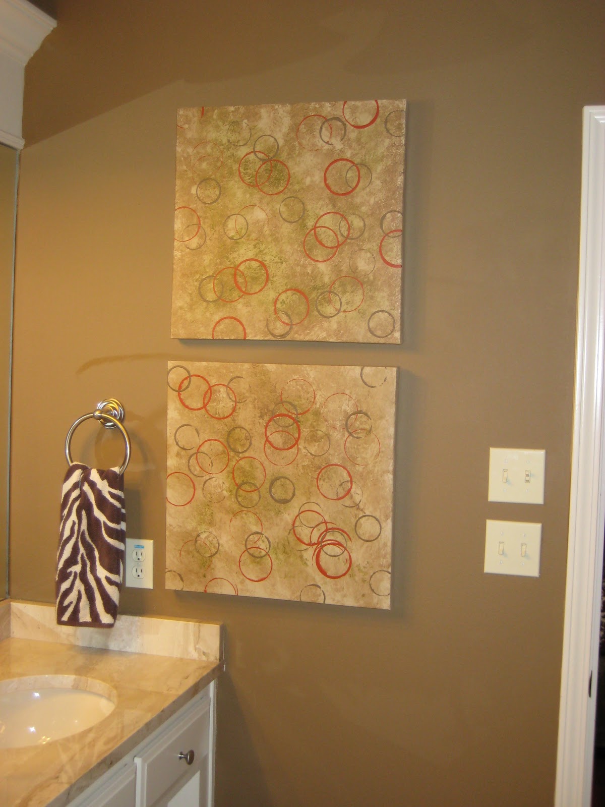
This is what the walls look like in the powder bath.  You can see the stripes, but it is very subtle.  The lesson learned from doing tone-on-tone stripes is that this effect works better with darker colors.  In hindsight, I should have used the next color above the Cloudy Sunset to paint the stripe. 

The stripes are subtle.  Notice the stripe above the painting.

More importantly, my brother and sister-in-law are happy with the end result, so I guess that is all that matters! 

Tone-on-tone stripes are a great look for a lot of rooms in your home.  The effect looks great in a formal dining room.  If you have a chair rail in this space, vertical tone-on-tone stripes would really make an impression.  This would also be a great look with a harlequin pattern.  I am dying to try this in my powder bath.  Of course when I do, you will be the first to see it here!

Monday, December 12, 2011

Don't Be Afraid of the Dark!

Happy Holidays to everyone!  I've been a little behind on my postings.  Hopefully I can squeeze in a few between now and year end.

I saw this quote on Twitter from House Beautiful:

"Darker colors are always sexy. They warm things up and make everyone look better."

On Saturday, my nephew and I went on the Christmas tour of homes in Little Rock.  Every year during the Christmas season, five to six homeowners will open their homes for toursSince I am a house voyeur, this is right up my alley!  All of the homes on the tour had dark colors in the main living areas and in some of the master bedrooms.  The dark colors definitely made the rooms more dramatic.  Unfortunately, I have no photos to post.  You will have to trust me when I tell you the homes were fabulous!

BTW, Chris Olsen has his first book out--"Chris H. Olsen's Five Seasons".  I went to his launch party December 9th.  Beautiful photography of Chris' home.  Chris offers great decorating ideas for the home and garden.  For those of you who don't know who Chris Olsen is...  Chris is a landscape architect, interior designer, business owner, TV host, and all around nice guy.  I have known Chris for about 10 years now.  I saw Chris this Saturday and told him that I loved his book but there is no way I can make the beautiful craft projects featured in his book.  Chris' response to me, "If I can do it you can do it!"  You can find his book at http://www.leisurearts.com or check out your local Barnes & Noble.

Monday, November 28, 2011

Don't forget the exterior at Christmas time

Last year, I came dangerously close to turning into the Griswolds!  I decided to purchase 21 net lights to add to the shrubs outside my home.  That is a lot of lights.


It was beautiful and my neighbors' children loved it.  I did almost the same look for this year, but I didn't put out all of the net lights this year.

For the past 10 years, I think I have been using the same two porch size Christmas trees at my front door.  I would have a wreath in the middle and some years, garland.  This was my front porch at the house I lived in from April 2000 to July 2005.


For 2011, I decided to change things up.  I purchased a set of three whimsical trees from Sam's Club for the front porch and I also changed the wreath on the front porch.  I found the wreaths at Target.  I purchased three and joined them together with zip ties.  The Christmas boxes came from Gordman's. 


With a little bit of money and imagination, you can add Christmas sparkle to your front door and/or porch!

It's beginning to look a lot like Christmas!

I love the holidays, especially Christmas.  I don't like the hustle and bustle of Christmas, but I do enjoy looking at all the holiday decorations.   I try to attend as many Christmas parties and open houses that I can fit in.  Yes, I admit, I am a decorating voyeur!  I like to see how others decorate their homes, inside and out.


Starting the Friday after Thanksgiving, I dismantle the fall decorations and start installing the Christmas decorations.  My 17 year old nephew, Ka'Run, has been decorating my tree for the past three Christmases.  I go to bed and wake up the next morning to a fully decorated tree!


The theme for Christmas 2011 was to do a traditional tree.  So, my nephew decided not to use the gauzy netting and just use ribbons and overload the tree with all of my ornaments.  Everybody does the netting.  I think it must be a Southern thing.  I never see it used on trees outside of the south.  I like to see the netting used, but I don't like it to cover up the greenery on the tree.  When you can't see the greenery, I think too much netting has been used.  Ka'Run also decorated my mantle.  My nephew has a real talent for decorating trees.  Pictured below is how he decorated my tree for Christmas 2010:


Since my living room is small, I usually limit my decorations to a tree and the mantle.  I used to put a nativity set out and add other festive items to my coffee table.  I thought it was a little overkill for the space, so I decided just to stay with the tree and mantle.

So, if you have decorated for Christmas, keep your curtains and blinds open.  You never know who may be coming by to sneak a peek!

Wednesday, November 16, 2011

First Impression

You've heard the phrase before about making a good first impression.  College students are told to wear a classic navy suit to job interviews to make a good first impression.  A prospective employer will size an applicant up before the two shake hands.  First impressions apply to our homes as well.  Every place I've lived, including apartments, I've always decorated my front door and porch.  For me, this sets the tone for what you can expect once you enter my home.  Throughout the year, there is always something decorative on my front door and on the porch.  I really love the Fall/Thanksgiving and Christmas seasons because you can really showcase your entrance.  I've had this arrangement on my front porch since the middle of September.  In a little over a week, I will transform the porch with Christmas decorations.


This is a fairly simple look.  I keep the urns on my door year round.  Depending on the holiday or season, I will change out the plantings.  Here's a little secret--the plants are silk mums.  I tried the real McCoys one year and the flowers died before Thanksgiving.  So, I resorted to silk mums that I can use year after year.  The pumpkins were purchased at Michael's.  Several of my neighbors and guests have commented that they thought the pumpkins were real.  The doormat was purchased from the Lillian Vernon catalog.  I have purchased six doormats from this company.  Lillian Vernon offers great seasonal doormats.  I change out my doormat to reflect the season and/or holiday.  The wreath was purchased at Sam's Club several years ago.  I think I will retire it after this season.  If your front door has a western exposure like mine, the sun can be very hard on wreaths and live plants/flowers.

For all of my homes, I've either painted the front door red or had the builder paint it.  I've always loved a red door.  It adds a pop of color to any home.  Having a color at the front door can do a lot to boost your home's curb appeal.  If you have a bland or colorless front door, consider painting it.  I would use a brighter hue so that the color is noticeable from the street.

Here is a good example the impact that paint can have on your curb appeal.  Here is a before picture of this home's front door.  Doesn't look very inviting, does it?

From House Beautiful

Now take a look at the entrance.  By removing the storm door and changing out the light fixtures and updating the hardware, the entrance to this home has been changed from boring to fabulous!!

From House Beautiful
So, if you want to make a good first impression, spend a weekend with a gallon of paint!

Monday, November 7, 2011

My Very First Art Project

About a month ago, I decided to change out the artwork in my master bath.  I have wall space on both ends of the vanity.  With no artwork, the space is pretty bare.  My friend Rosie doesn't think artwork belongs in a bathroom.  I am going to prove her wrong.  Initially, this is what I had on both sides of the vanity:


I lived with this look for a few years.  Then I decided I needed a little color on the walls.  So, since I have developed a love of abstract art, I purchased these paintings at Target.


After looking at these paintings for about a month, I decided that maybe this was too much color and pattern.  The pattern was a little overwhelming for the space, especially with the paintings hanging at both ends of the vanity.  I had been thinking about painting over the artwork and creating my own art.  So, I finally did my first artwork Sunday evening.  I used existing interior paint that I already had.  I painted over the artwork with a base coat of Sherwin Williams Latte.  I then mixed Sherwin Williams Coconut Husk with glaze and applied this to the canvas with a rag.  I repeated this step with Sherwin Williams Loche (green).  The final step was to create the circles by using the opening of empty glass jars in two different sizes.  I used Rustoleum Paprika for the red circles and SW Coconut Husk for the brown circles.  Voila!


My artwork is a lot more calmer and tamer.  I still have the circles, but they are smaller and not as intense as the previous look.  And more importantly, I don't get vertigo when I walk into my bathroom! 

The great thing about abstract art is that anybody can do it.  Abstract art doesn't require you to have the ability to draw.  Buy a canvas, pick colors you like, and go for it!

Thursday, November 3, 2011

Naked Furniture

Today's post is about dressing up your furniture--sofas and chairs--with pillows.  Whenever I see a chair or sofa without accessory pillows, I think of the furniture piece as naked.  Accessory pillows can make a plain, ordinary piece of furniture into a show piece.  Also, you can change out the pillows during the seasons or when the mood strikes you.  Every sofa and chair in my house has a pillow or pillows.  I even have pillows in the arm chairs in my dining room:


When I want a different look for the room, I move the pillows around to another seat or I purchase new pillows.  I recently pulled out my Mama's Singer sewing machine (older than me and I'm 50) and sewed pillow covers.

Most sofas will come with two matching accessory pillows or two matching pillows and two contrasting pillows.  This look is fine, but you are limited to the design or look of the furniture manufacturer.  There's no rule to say that you have to use the pillows that came with the sofa.

When I purchased my current sofa in 2006, I ordered four accessory pillows--two of the same fabric as the sofa and two made from the fabric of a contrasting chair.  This is the way the sofa look when I first got it.


I initially wanted a monochomatic look so I wanted the colors to be very neutral and muted.  I lived with this look for a few years, and then I decided to spice things up a bit.  I still have the two pillows that match the sofa fabric, but I added two pillows that I purchased from Dreamweavers and I made the giraffe print bolster pillow.  See how the sofa has been transformed below:


By adding a pop of color and bold pattern, the sofa has been perked up.


Chairs don't normally come with pillows.  If you have your furniture custom made, you can have pillows made for the chairs.  But again, you are usually limited to the fabric choices the furniture manufacturer has in stock.

Notice how plain this chair looks without a pillow:


Now see how much better the chair looks with a bolster pillow:


For a brighter look in the summer months, I found this pillow at Target:


See how changing out pillows in this chair gives the chair a totally different look.


The pillows you select do not have to match the chair fabric.  I try to find pillows with some of the same colors as the chair or sofa fabric but with a totally different fabric.  This adds a layer of texture to the room.

If you just can't deal with different patterns, you can still add some interest to your furniture.  I helped a friend to select the fabric for her custom made sofa and chairs.  She had two accessory pillows made for the sofa out of the chair fabric.  We then went to Bed, Bath, & Beyond and purchased pillow covers to match the red in the sofa.  A pop of red is just what this room needed.


If you want to change the look or mood of your room, try changing out the accessory pillows.  Don't be afraid to mix patterns.  Just make sure the pattern in the pillow picks up the color(s) in your sofa or accessories in your room.  Go for it!!
 

Saturday, October 29, 2011

Can't Find a Sconce You Like?--Make Your Own!!

For the past three weeks, I was working out of town and was lucky enough to stay at The Inn at the Mill in Springdale, AR.  This is a boutique hotel--small number of rooms, intimate setting, and the rooms are appointed with nice amenities.  I have managed to finagle my way into a few boutique hotels over the years.  This is not an easy thing to do on a government rate, but you never know until you ask.  The hotel was a mill back in the 1800's.  The property was turned into a hotel in 1991 and has undergone several renovations and updates over the years. 


As I was settling down in my room for the night, I noticed a wall sconce that was very cool.  Upon further inspection, I realized that it was a light.  I had never seen a sconce like this before.  I went downstairs to the front desk and asked the desk clerk about the sconce.  The story is that the owner of the hotel had the sconce made from a mold of his daughter's face.  She was a teenager at the time.  She is married to the owner/chef of James at the Mill and she works at the restaurant.  All of the rooms have this sconce and the restaurant has the sconces featured in the decor.


I would love to have a pair of these sconces in my dining room on either side of the mirror!

Wednesday, October 26, 2011

Color Courtesy of Mother Nature

I am working in Springdale, AR and right outside the location I am working is the most spectacular red maple tree.  This tree looks as if it is on fire.  This is why fall is my favorite time of the year.  Enjoy!

Quote of the Day!

I have a Twitter account and I follow several decorating Tweeters.  I saw this Tweet today from designer Bruce Norman Long posted by House Beautiful.  I think this quote best describes what I love about color:

"I like dark colors because they always make a room feel more decorated than it is."

I think this is so true.  On Saturday, I helped my neighbor Penny paint her dining room SW Coconut Husk (same color as my living room).  She loved the color when she saw it in my living room and wanted to paint her dining room this color.  Her dining room was red when she moved into her house 5 years ago and she never liked it from day one.  So, I schlepped across the street Saturday morning and we were done by noon.  The color change made a dramatic difference in the room.  This is the "after" photo.  I didn't get a chance to take a "before" photo.  Take my word for it--we did a dramatic color change.

Tuesday, October 25, 2011

How to Hang Artwork

In my previous post, I hope I got you inspired to buy new, big, and modern artwork for your home.  Once you get the artwork, you'll probably wonder how in the heck you are supposed to hang it?  One of my pet peeves (and I have many which I will share with you) is to see artwork that is improperly installed in a room.  I think I am going to put a small hammer in my purse so that I can undo all of the bad artwork installations I encounter.

Q:  How high should artwork be hung on a wall?
A:  It depends on the height of the wall.

Confused yet?  Here is my general rule for the proper height for hanging a single piece of artwork.  If your ceiling height is between 9 and 10 feet, try to hang the artwork between 70 to 75 inches up on the wall, assuming the hanging hardware is 5 to 6 inches below the top of the picture.  This is the point where the hooks should be inserted.  Why this measurement?  Artwork looks better if it is hung at a level where you can see it.  You should never look up to see artwork.  Also, if the artwork is hung too high, it will look as if it is floating in the room.  You want your artwork to ground the room, not get lost in the room.

If your artwork is hung over furniture (table or sofa), allow about 6 inches between the bottom of the artwork and the furniture piece.  This will keep the artwork from looking like it is floating over the furniture--not a good look.

For taller ceiling heights, 10 to 12 feet, you will need big art or groupings to fill in the larger spaces.  Try placing the hook 75 to 80 inches on the wall.  The thing to remember with taller ceiling heights is that you don't have to fill in the artwork to the ceiling line, unless you have a grouping that will be stacked.  It's okay to have empty space over artwork. 

This artpiece is hung in a breakfast nook of a house I decorated.  The ceiling height in the breakfast nook is 12 feet.  The artwork measures 4 ft by 3 ft.  The artwork is not floating in the room.


Big art, big impact!

Here is another one of my pet peeves:  Never hang your artwork taller than your door frame or window.  This is when you know your artwork is installed too high.

Look at the artwork in my living room.  My ceiling height in the living room is 9 ft/10 ft.  I have a trey ceiling that goes up to 10 feet, but the wall space measures 9 ft.  Notice the placement of the artwork:  it is hung below the door frames.


The artwork is not floating in the room, it has a relationship with the furniture.
Next, I want to show you the artwork in the living room of a realtor/interior decorator Cara Wilkerson.  She has a great blog called, "Live the Home Life".  Cara's blog can be found at http://livethehomelife.blogspot.com/

This is a great example of grouping artwork together.  Individually, the artwork is not that big, but hung together, the artwork makes a big impact.

Isn't this a great way to hang artwork?
Another example is shown in this photo from House Beautiful magazine.  Notice that this artwork is hung at the ceiling height, but it still grounds the room.


Take a look at the artwork in your home.  If it is hung too high, try lowering it and notice how this small change wil transform the room.  Get your hammers ready!

Monday, October 24, 2011

Artwork: Go Big or Go Home!

Artwork makes me happy.  I have artwork in every room in my home--including the bathrooms and laundry room!

Artwork in water closet in master bath--example of a big piece in a small space.

Artwork in master bath over both sides of vanity.

Artwork is personal.  What I like and what makes me happy may do nothing for you.  This is how people should respond to artwork.  If you see a piece of artwork in a store or gallery that you absolutely fall in love with it, you should purchase that art piece (if it's within your budget).  

I have grown very fond of abstract paintings.  I love a traditional room, but I don't mind my artwork being contemporary.  Since 2005, I've purchased 10 abstract paintings for my home.  I have replaced older prints and paintings with the abstract art.  I love the movement and color in abstract art.  I don't "see" anything in the artwork, but there's something about the colors and the flow of the painting that draws me in.

Here is my rule for artwork--Go Big or Go Home!  There is nothing sadder than a small picture or painting hanging on a large wall by itself.  Big art makes a big impact.  Whenever I have people in my home for the first time, the first thing they notice is the artwork.

I want you to see an example of how I replaced traditional artwork with an abstract painting.  The first picture is the before of the artwork in my breakfast nook.  I had a fruit theme going on in the kitchen and breakfast area.  I found two fruit prints that I hung stacked over the buffet server.  I liked the prints but there wasn't much color to them.  BTW, I still have these prints if someone is interested in them and the fruit pitchers on the buffet.


When using smaller pieces of artwork, try to group the pieces together.


This is how the breakfast nook looks with an abstract painting over the buffet.  Notice how the artwork pulls you into the room.

This painting was purchased at Bed, Bath, & Beyond--not expensive at all.
In my earlier post about painting, you learned that I have no wall space in my foyer for funiture or artwork.  To the right of my foyer, is my formal dining room and a wall that leads into the kitchen.  This wall is part of the hallway that runs from one side of the house to the other.  I consider this wall as part of the entry due to the proximity to the foyer.  You can see this wall from the foyer.  I can't place furniture there because it is the hallway.  So, my solution was to place artwork on that wall.    Red is a dominant color in my dining room, so these abstract pairs were a perfect fit.  Notice how well the art pieces fill in the space.


If you are redecorating a room(s) in your home, consider large artwork for the walls.  Be sure to check the big box stores in your area.  Most of these stores have a great selection of large prints and abstract art.  Also, I ran across this website which has a huge selection of abstract art at great prices:  

http://www.gallerydirect.com

You will be amazed at the impact large art will make! 

Tuesday, October 11, 2011

Pillows: Why Women Love Them and Men Hate Them

I think the argument over pillows between the sexes has been going on since the beginning of days.  I don't know any man that likes pillows.  Here is the basic difference of how women feel about pillows versus men:  For women, pillows make the bed more romantic.  It's like we're in a fairy-tale waiting on our Prince Charming to come and swoop us away.  Every woman wants a beautiful bed.  For men, pillows are just additional crap that has to be removed before going to bed.  Men, this is a losing battle.  Get used to the pillows because they're here to stay. I have accessory pillows in all of my rooms (with the exception of the kitchen and bathrooms).  Pillows add a little extra pop of color, especially in spaces where the decor is monochromatic or very neutral.


Let's talk about pillows on the bed.  As long as I can remember, I've always had pillows on my bed.  I can remember going to Dillard's Department Store and going to the Linen Department.  I always loved seeing the different bedding sets displayed.  What made these beds so beautiful was the pillows.  I think the biggest mistake many people make is too many pillows.  This is why men hate pillows.  I have seen beds with as many as 10 accessory pillows piled on top.  Usually the pillows are randomly and haphazardly displayed.  That's when you know there are too many pillows on the bed.  I have seen beds where the accessory pillows are piled on top of the pillow shams.  Accessory pillows should always be placed in front of the pillow shams or pillow cases, never piled on top of the pillow shams or cases.

Here is my basic rule for pillows on the bed.  I have a queen sized bed.  I use two European shams (You can use 3 Euro shams for king beds).  Euro shams are a must because they anchor the look.  You can buy the 24 inch pillows that go inside the shams at Garden Ridge or Bed, Bath & Beyond.  Don't use standard pillows--it doesn't look right.  Euro shams are placed next to the headboard.  I then place either my sleeping pillows or the pillow shams in front of the European shams.  If I have pretty pillow cases, I will place the pillow shams in front of the Euro shams, then the pillow cases.  Next, I place three accessory pillows in front.  The accessory pillows don't have to exactly match the comforter.  I think it's a more interesting mix to purchase accessory pillows with some of the colors of your comforter but a different pattern.  The picture below shows my bed as it is dressed for the fall and winter.  The accessory pillows did not come with the comforter set, but they match up with it pretty well.  When I'm ready for bed, I just removed the Euro shams, pillow shams, and accessory pillows. 


You may be able to get away with 5 accessory pillows, but you are pushing the limit.  I know someone whose husband doesn't understand the concept of Euro shams.  She had to remove them.  Her husband makes the bed up before he goes to work (he's the last one out in the mornings).  So, she had to give up her Euro shams because her husband didn't understand the need to have them.  Now that's really sad.

Sunday, October 9, 2011

Where Michelle Likes to Shop

I live in Little Rock, AR.  Some of the stores I mention may be in your area if you live outside of Little Rock or out-of-state.  If you frequently visit my home, you will notice that I have a tendancy to change out my artwork and accessories.  I may love a piece of artwork when I first purchase it, but I tire of things pretty quick.  Over the years, my niece has gotten some pretty nice furniture and artwork from Aunt Michelle.  So, where do I like to shop in Little Rock for accessories?  Any place where I can get nice accessories for dirt cheap.

If you are looking for inexpensive accessories, artwork, and pillows, Garden Ridge located at Bowman Road and Chenal Parkway is by far the best place to go.  I knew about the accessories and artwork that Garden Ridge sells, but my neighbor Penny turned me on to the store's pillow selection.  Most of the pillows in the store are priced at $10.  Garden Ridge has thousands of pillows.  The store also has a great selection of artwork on canvas.  If you are into abstract art and don't want to spend a lot of money, Garden Ridge is the place to go.  Here is an abstract canvas art piece I purchased for $79!!.  It was described as an actual "oil on canvas" piece.


Hobby Lobby (located at Bowman Road & Markham St) is also a good place for accessories.  Check the Sunday paper for the sales items for the week.  I never pay full price at Hobby Lobby.

My neighbor Penny introduced me to Dreamweavers (located downtown at 11th & Spring St).  Dreamweavers sells rugs, pillows, and throws.  The items are unusual.  You won't find this merchandise at other stores in town.  The store also features accessories and limited artwork.  Dreamweavers is only opened the 2nd weekend of every month.  I purchased two rugs for my master bath and pillows for my living room from Dreamweavers.


The pillow is made out of neckties!


The rug is made out of old stockings & pantyhose!

Steinmart (Cantrell Rd and McCain Blvd) has a small accessory section in the store.  On occasion, I will drop in there to see what they have.

Burlington Coat Factory (Markham St & McCain Blvd) is also a good place to go.  The store has artwork and is a good place to go for glass work.

Just recently, I found a good place to purchase rugs--Aladdin Rugs & Home Decor located at 4529 JFK Blvd.  The store has a very good selection of rugs in different sizes.  I took my friend Marjorie there about two weeks ago and she purchased a wool rug for her study.  The rug measured 5' by 8' and cost $200.  For a wool rug, that is an excellent price.

http://www.aladdinsuperstore.com/

Gordman's is another place to get great accessories at a good price.  Gordman's has great glass pieces.  If you are looking to fill in blank spaces in your bookshelf or end tables, this is your store.

I also like to shop at Bed, Bath, & Beyond and Kirkland's for artwork.  Both stores have canvas art.  Always use Bed, Bath, & Beyond's 20% off coupon.  Kirkland's has great sales and you can purchase a pretty large piece of art for under $100. 

Little Rock has several furniture and accessory boutique stores (Pazazz, Coming Home, Phoenix Interiors).  These stores are not the cheapest, but they have some really cool inventory.  Sometimes you can get a better price if you just ask.  Check out some of the boutique-style stores in your areas.  Sometimes you may find an accessory that is one of a kind and it may be worth the price you pay.  I purchased this glass piece at Phoenix Interiors.  It is a glass knot.  It wasn't cheap, but I treated myself for my birthday one year.  It looks really cool on a glass coffee table.


Consignment sales/stores are also a good choice.  In Little Rock, there is a lady who has a consignment business.  She gets really nice pieces of furniture.  My friend Marjorie was able to find the nightstands and an armoire that matched her bed and dresser.  She also purchased the artwork that is in her breakfast nook.  I'll share photos from her home on a later post.  The website for this business is:

http://www.iconsign-furniture.blogspot.com/

Her inventory constantly changes.  Check it out.

If you are willing to hunt around town, you can get some pretty good deals on accessories for your home.  Happy Hunting!!  

The Allure of Color

The use of color frightens a lot of us, but it shouldn't.  Our lives are filled with color.   Yet when it comes to applying color to our walls, we can't seem to decide on a color so we do nothing.  Fall is my favorite season.  I guess that is why I am drawn to tans, browns, reds, oranges, yellows, and golds.  I gravitate more to darker colors.  For me, a room painted in a darker hue grounds the space.  As I am writing this, I am sitting in my living room which is painted SW Coconut Husk.


SW 6111 Coconut Husk
It is the darkest color on the color chart (#16).  I'll admit, I was a little hesitant to try this color.  Once I applied the first brush stroke, I immediately fell in love with the color.  The color is dark, but I consider it a neutral, just as taupe or tan is a neutral.  The richness of this color makes the other colors in the room pop.  Notice how my living room looks painted in its original color, SW Latte.  It's a warm, neutral color but it just says, "Blah" to me.  It's as if the wall color is competing with the colors in my furniture and artwork. 


Blah-blah-blah!!

 
Now notice how the room looks painted in SW Coconut Husk.  Notice how the artwork and the orange/rust pillow in the chair pops against the dark walls.


My advice to anyone who is thinking about painting a room:  You must love the color.  It has to make you happy every time you step into the room.  If it doesn't, then find a color that makes you happy. 

If you don't know how to paint, don't let this be an excuse for not changing the wall color in your home.  The first time I ever painted was back in the late 1970s while I was still in high school.  I wanted my bedroom painted dark blue.  I hired my neighbor's son to paint the room.  I thought that I would love the color, but I hated it.  In fact, the room depressed me.  So, I decided to repaint it myself and I painted the room peach--it was a happy color.  I loved the color and the walls remained peach until my mother's house sold in October 2005.

Painting a room is not the only way to add color to a space.  Placing accessories in your favorite colors can liven up a room.  Notice how the color orange pops in this room.  This is a very neutral room, but the room perks up through the orange pillows, rug, and drapes.


Find a color that you like and purchase pillows, vases, and artwork in that color.  This works well for a room that has neutral walls and furniture like the room in the picture above.  Adding your favorite color to a space adds instant happiness!  The beauty of adding color with accessories is that you can easily change the mood in a space by changing the accessories.  Or, if you decorate by the seasons, you can change out pillows and other accessories to match the season.  My sister-in-law, Sadie, is the queen of changing accessories.  She has several looks for her dining room based on the seasons.  For fall, she has an olive motif.

If your room needs a pick-me-up, color is the best therapy!